One Room Challenge Week 1 – Taking on my Front Room / Dining Room
Here we go again friends – it’s time for the Spring One Room Challenge!!! This is my second time participating (for my first challenge I made over my guest room and you can check out the final reveal here) and I am possibly more excited this time around. The lessons I learned last fall about both blogging and designing were invaluable in helping me take this little page of mine to a new level.
For anyone new to this event, the One Room Challenge is an amazing opportunity for home bloggers hosted by Linda at Calling it Home in partnership with House Beautiful and the Home Love Network. During the next 6 weeks a group of over 200 guest and 20 featured bloggers will take the challenge to transform one room in their homes and share their progress each week.

A big Thank You to Legrand for sponsoring me in the One Room Challenge!
This time around I’m not sticking to one room, I’m tackling TWO – my front room and my dining room. Since they open up to each other it was difficult to design one without considering the other so I’m going for it and updating them both. I also won’t be able to participate in the fall challenge this year so doubling the workload was obviously the “smart” thing to do.
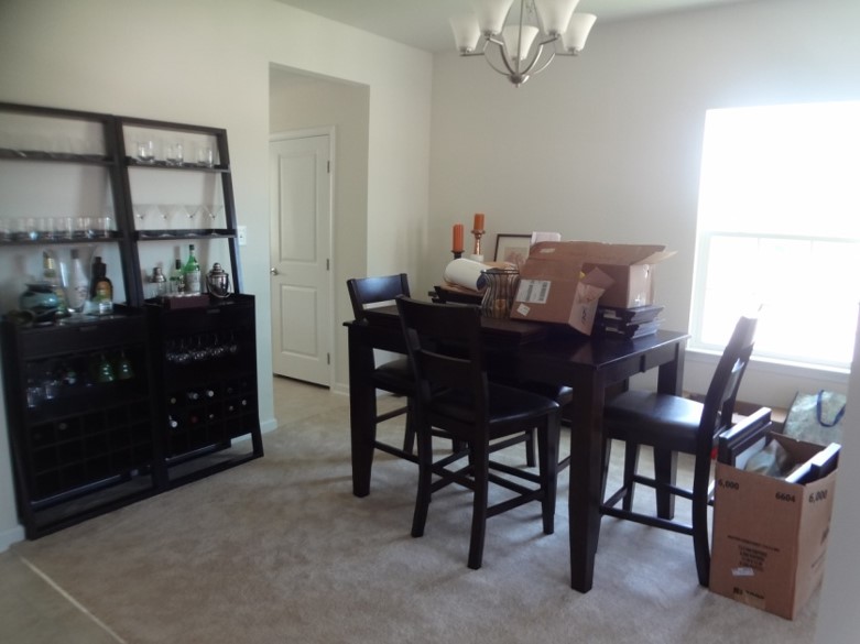
So….let’s get started shall we! Here’s a peak at what these two rooms looked like when we moved in four years ago in all their builder grade glory. It’s hard to photograph both spaces together but they are basically two square rooms that sit on top of each other with a large opening in the middle, and a long hallway along the left hand side that runs from our front door to the back of the house.
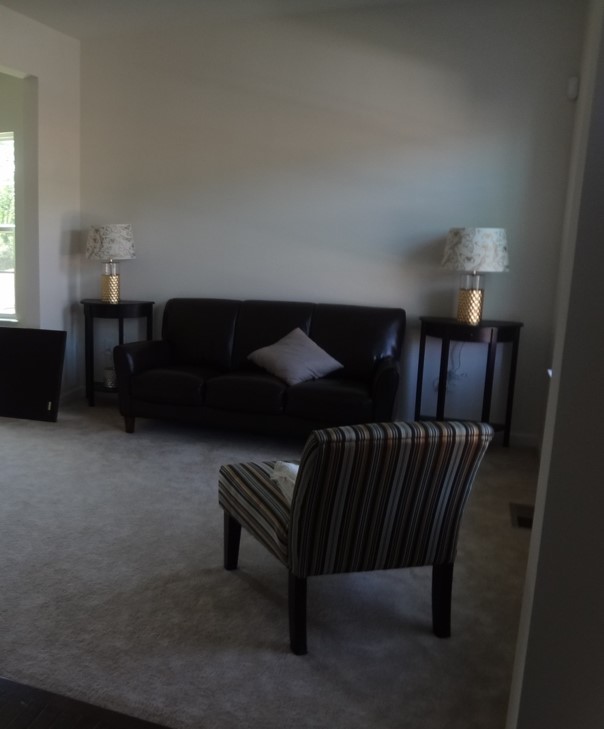
I know a lot of modern floor plans don’t include a formal dining room or front room, but I am a fan of both and I especially love the way ours are laid out for a few reasons:
- They are both pretty small rooms so they don’t take up a big footprint in our house
- I don’t like people watching me while I cook so a separate dining room is great for dinner parties (that little hallway in the above picture is the passageway into our kitchen and it reminds me of an old butler’s pantry)
- The back of our house is a completely open concept living room/kitchen/morning room and we have a big loft upstairs so we’re not lacking in open space
- I walk down this hallway 100’s of times each day to get from the staircase to the kitchen so being able to look at a more “adult” space on that journey is a lovely treat
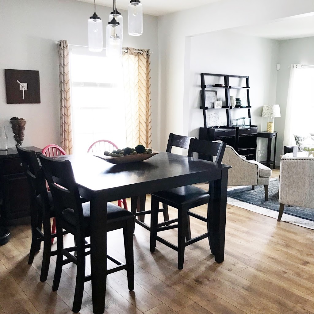
Here’s a good shot of how the two rooms look today and a better idea of how the they flow together. In the last few years we have made a few updates including painting (Sherwin Williams Frosty White), replacing the carpet w/new floors (these are Pergo Laminate in Riverbend Oak – we have them upstairs and downstairs and they are AMAZING!!), changing out the builder grade light fixture to this one from West Elm (which they sadly don’t sell anymore), and incorporating some new furniture (particularly in the living room, most of which will be staying so I’ll share all of that info in weeks to come).
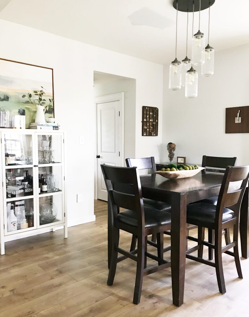
But the truth is both rooms still look like little blank squares and could be so much better! I have been playing around with layouts since we moved in, but over the winter I finally figured out what was missing…height and pattern. So the last few months I’ve been coming up with the following mood board mixing pieces I already have, brand new pieces, and of course pieces I’m planning on building.
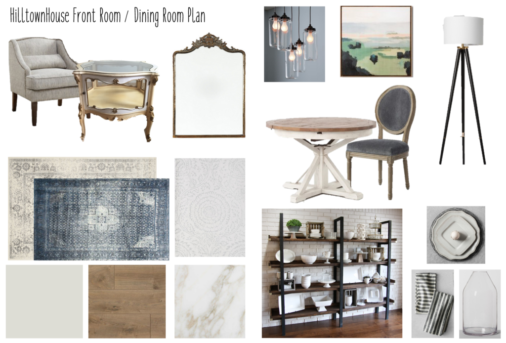
I’m trying to keep these spaces formal but not stuffy while staying very bright and fresh. I want them to feel like they could belong in an old farmhouse turned B&B with a mix of vintage and modern that walks the fine line between cozy / cluttered. Most of all, I don’t want these spaces to feel like they’re completely off-limits to my family. I’m designing the dining room table with the thought that me and my boys can use it for craft time, and I can tell you that the dog has already totally claimed that blue rug!
It’s going to be a lot but if I stay on track I think I can accomplish everything. I’ll be sharing my day to day progress on Instagram, and sharing a new update on the blog every Thursday (check back next week for a closer look at the plan for each room).
And make sure you check out all of my fellow guest participants on the One Room Challenge Website! I know what I’m going to be doing this weekend, you know, in between hours and hours of caulking.
Thank you to my sponsor!
A huge thanks to my sponsor, Legrand. I can’t wait to share more about them and how their Radiant Collection of light switches and electric outlets can easily update any space. Stick around to see them soon!!!


Comments
Yes! I can’t wait to see the finished rooms!
Thank you girl!!! I’m already exhausted LOL but it’s gonna be worth it
Loving the mood board and the color palette! It’s going to be so pretty! Hang in there – it gets hairy the 3rd week 🙂
So glad you like it! And you are so right – Week 3 is definitely a little panicky LOL